Wednesday, June 19, 2013

International Quilt Festival-Chicago

I had two weeks to get my act together because I am doing a 2 hour demo at the International Quilt Festival in Chicago this Sat. June 22. The show is June 21-23, 2013. I am thrilled it is returning to Chicago after being gone for 3 years. I decided to make a wearable art-like garment and I cut the sleeves of a denim jacket I wasn't wearing and thought I'd raw edge fuse applique my business name to the back for some free advertising! The front has several felt flowers with button centers. I did funky stitching with variegated thread around the collar, armholes and front opening and chose to stop and say that was enough embellishments. I will wear it the day of my presentation so if you see me at the show s
stop and say "hi!"

Wednesday, June 12, 2013

Modern Roue Chromatique (Modern Color Wheel)

I found a photo of this quilt on Pinterest and loved it because of the rainbow colors and I love a double mirror image symmetry style quilt. I tried to find a pattern source and I found the origin of the photo from Australia and several color variations but no pattern.
 This is the pattern I found on Pinterest but didn't want the blue color hues to dominate. I used graph paper and designed the quilt the way I wanted the colors with blue on the outer edges, red and pink the dominating colors and yellow and green in the center. This became my placement guide for the piecing of the triangles and squares.
I made 3 more copies of my graph paper color placement and taped them together which allowed me to visually view the full quilt.
I then made oodles of half square triangle combinations, cut out plenty of the white swirl tone-on-tone background fabric and many squares as well. I am not a fan of Thangles because it is a paper mess and not necessary. I use the method of adding 7/8" to the finished size of the square for the cutting size. For example this quilt had a finished size of 2" blocks. I cut the squares 2 7/8" and drew a diagonal line through the square and sewed two together 1/4" on each side of the line, cut on line, press to darkest side, and ta-da, a half square triangle.
The most difficult part of this quilt was the placement of the triangles-I hade moments of seam ripper madness. There is NO wiggle room because the contrast is so strong in this quilt!!

This photo shows the "pebble" quilting. There is lots of negative space in this quilt, as is many of the Modern Quilt Movement quilts, and I chose the pebble design as a contrast to all the angles in the piecing.
I will use this quilt a a teaching tool for when I teach color theory and the elements/principles of design classes.

Sunday, June 9, 2013

A Sunny Disposition

 I made this wall hanging for two reasons. One, Studio Arts Quilters Association was having a themed exhibit called Color Wheel of Emotions and, second, when I teach color I always talk about limiting the use of yellow in it's true hue because it will overpower other colors. So I was thinking if all the colors of the quilt were yellow then they would complement and not compete with each other. I have made this pattern three times before and love it so I used it again!! I have 25 VALUES of yellow and positioned them so the lighter ones are where the face applique will lay and the rest of the yellows fade to the darker shades toward the left side of the picture. I embellished the quilt with yellow and gold rhinestones in the background,  gold beads and a yellow felt button for the necklace, a silk flower in the hair, gold glitter on the lips and bead work on the cheek in the shape of a sun. I machine quilted sun motifs on the face as well. I am a sunlight person and I love certain songs with sun or sunny in the name. This quilt did not make the cut for the SAQA exhibit-there were over 260 entries and only 19 were chosen. I don't really care because I love my little sunshine quilt and I can also use it for my "Color Is Our Friend" class/lectures and for my design classes as an example of a monochromatic color scheme.
This photo is a close up of the face. I found this great batik for the hazel eye color-it looks like a real iris! The fabrics make me smile because they are so happy!! I chose to use brown as my applique color instead of my usual black because I thought it seemed softer than black but still provided contrast to the yellows.

Thursday, April 25, 2013

Payback Quilt and Gratitude!!

I have a Facebook friend I have never met and I can't even remember how we found each other but we have a lot in common. We are both Baby Boomers, love peace signs, hippie chick stuff, share political views, rock and roll music and she mentioned she wanted to start quilting so I answer her questions when she asks.
 
I love Tina Turner and there is a Facebook page about getting Tina into the Rock and Roll Hall of Fame. (Her and her creepy ex-husband, Ike, are in the Hall of Fame recently.) So on the FB page they are always posting anything new and relevant about her life. Tina was on the cover of the German Vogue magazine. I commented that "I would love to get my hands on this!" About three weeks later a package arrived at the salon I work at and there was the German Vogue from my FB friend!! I was in shock that she even saw the post and then took the time to get me this magazine. She said she has a friend in England who bought it and shipped it to her in North Carolina. (Ilive in Upper Michigan.)
 
So as a sign of gratitude I made her this cute little quilt sized at 12" x 12" based on one of my patterns. I knew my FB friend had straight brown hair, loves tie dye stuff and peace signs so I incorporated these things in the quilt. It was fun to make and I mailed it out to her a week later!! She loved it and I feel good she has it and I can think of her kindness every time I look at the pictures in the German Vogue-I don't know German so I can't actually read the Tina Turner acticle!!

This is the close up photo. I added rhinestone earrings and necklace and  glitter on the eyelids and hair. Peace Out!!

Sunday, April 21, 2013

2013 Sacred Threads Quilt Exhibit Acceptance

I entered the 2013 Sacred Threads Quilt Contest which is in July in Virigina. It is an exhibit which has spiritual themes of healing, joy, peace/brotherhood, grief and others. I had a quilt in the exhibit in 2011 (the show is on the odd year) and I entered the maximum 2 quilts. The first is the quilt above titled "My Friend is Bipolar" which was intended for the SAQA Exhibit last year called "I'm Not Crazy!" (not so great of a title in my opinion.) I poured heart and soul into this quilt because people in my life that are very close to me are bipolar. This quilt represented my view of living with people who are Bipolar. I was quite bummed when it did not make the cut. When this exhibit call to entry came around I selected the "grief" category and it was juried into the show!! Their website is www.sacredthreadsquilts.com
The woman on the left represents the "manic" side of the personality disorder-very grandiose, over the edge, frantic, excessive, hyper etc. She is not easy for me to look at because she screams irratic!!

The woman on the right represents the "depressed" side of being bipolar-stressed, low self esteem, gloomy, pessimistic etc. I feel I have captured her pain.
 
The colors I have chosen for each side of the Bipolar Disorder is also representational. The clothing, the hair, the jewelry etc. all reflect this.

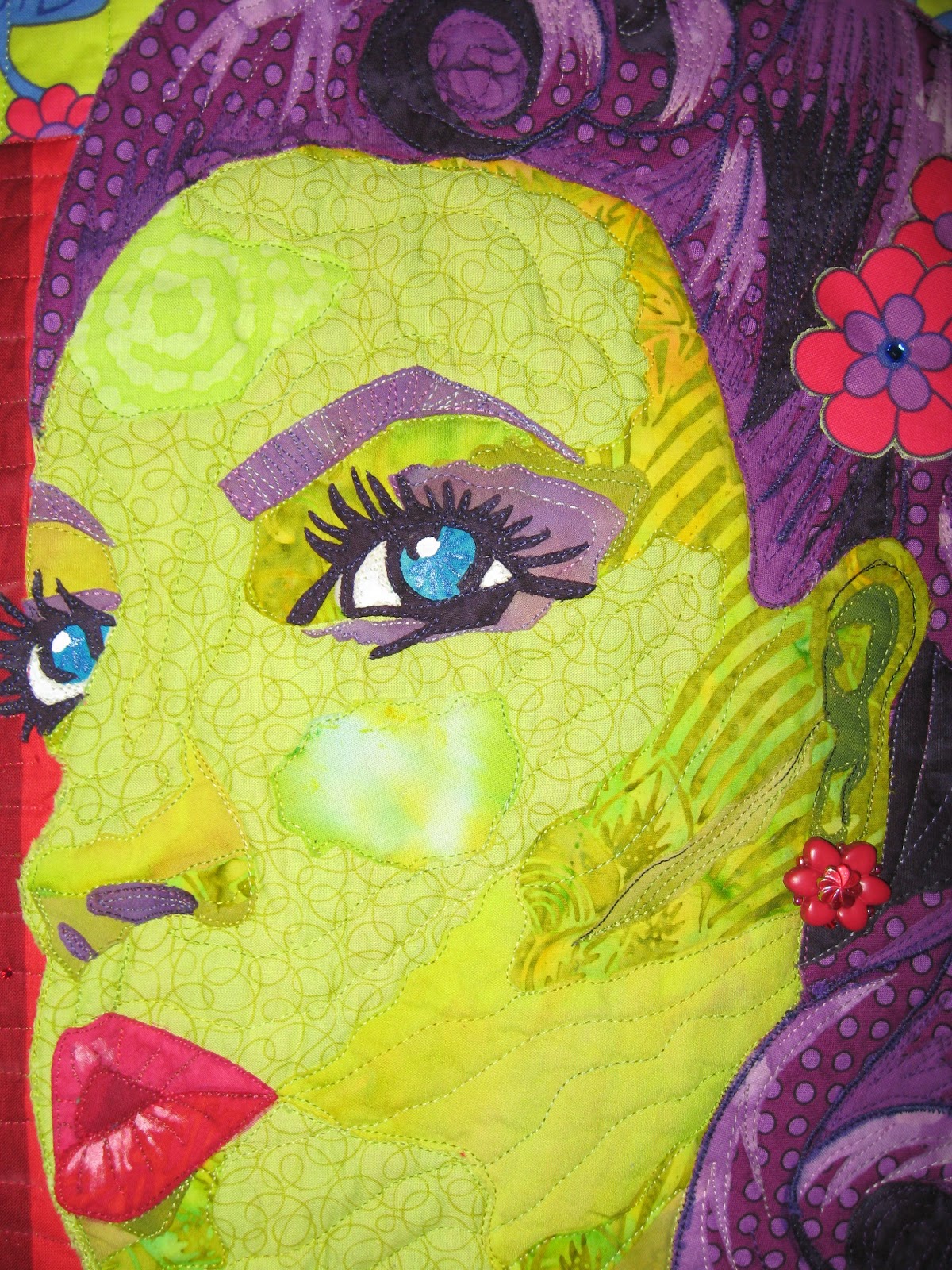
My quilt "Victory Rolls" is near and dear to my heart because it is a perfect representation of me- the hairdresser, fashionista and lover of bright colors, flowers and embellishments. Therefore I put it in the "joy" category and it was also accepted into this exhibit!!

I went on a limb and gave my 1940s woman green skin because I love lime and chartruese!!


Sunday, April 7, 2013

Simply Summer

Pine Street Quilts, where I work part-time, got in new charm packs from Moda called "Simple Marks" by Malka Dubrasky. She had a previous line last year and I loved it! The bright cheery colors and the bold geometrics intrigued me and this new line was just as awesome-plus there were polka dots in the collection!! I decided to use AGAIN the "Oh Sew Charming" pattern for the third (and last) time but I also included the beautiful floral instead of just using the charm squares. I found the colorful floral with the white background at the Appleton WI Hobby Lobby and thought it went nicely with these colors in the charm squares. I am also embracing the Modern Quilt Movement and I see a lot of white instead of black with bright colors in the quilts of this movement. I fussy cut four center block pieces as best I could to have the four color "families" represented and also used the floral on the outside corner blocks, the binding and the back. I chose a white with turquiose dot for the background fabric and a variegated thread with turguiose, lime green and a bit of yellow for the quilting. I though it stood alone without any embellishments and it was looking like tropical fruits or fruity Lifesaver wrappers. I call it "Simply Summer" because of the Simple Mark charm pack name and the feeling of summer's bright colors. This is my favorite of the three charm pack patterns because the bright bold colors are my favorites and I love the bold geometric African-like designs plus the great contrast with the white backgorund. It is a happy quilt!!

Wednesday, March 27, 2013

Check Out The New Book-My Quilt Is On Page 107!!

As a member of Studio Art Quilting Association different opportunities are presented to us at all times. The woman who heads this organization, Martha Sielman, works with Lark Books and creates art books with themes. She chose "people and portraits" after doing books on landscapes etc. and she personally sent me an email to apply. I was flattered and entered 3 quilts (the maximum) and waited a very long time to recive any news about the book. Late fall I received notice that my Tina Turner quilt would be in the book and I was thrilled. It is due for release in April and can be pre-ordered from Amazon.
My quilt is on page 107 which is nice since 7 is my lucky number!! The photography is beautiful and the quality of the book is very nice. Hopefully you will check it out and/or purchase it.